Swann Galleries
As a renowned auction house, Swann Galleries' website serves as a critical platform for showcasing and selling their wide range of art and collectibles. They however found themselves in a legal situation for their website not being accessible and did not comply with the Web Content Accessibility Standards (WCAG 2.1).
The Goal
Enhance the user experience through the incorporation of modern UX interactions and address the ADA compliance errors both visually and programatically.
Project Type
Website design
Role
Lead Designer and Project & Client Manager
Tools
Photoshop
Timeframe
1 Year
Color Palette
Typography
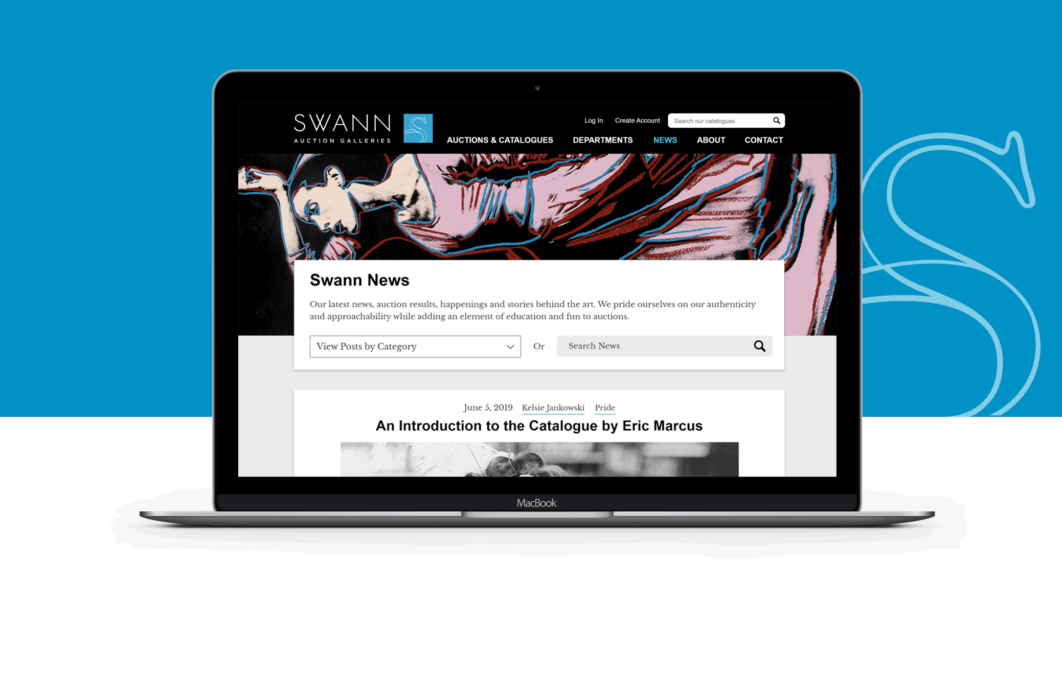
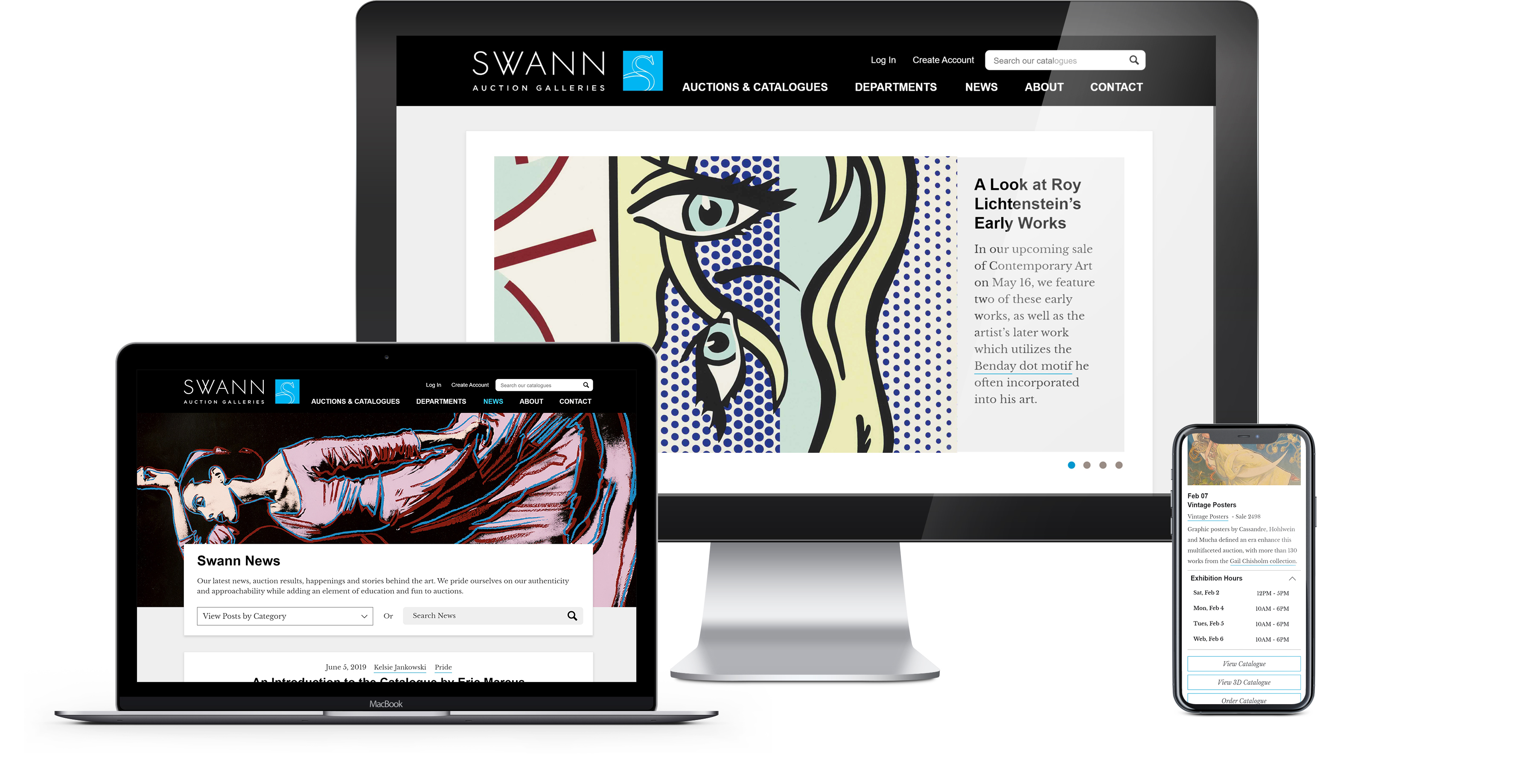
Updating the existing branding
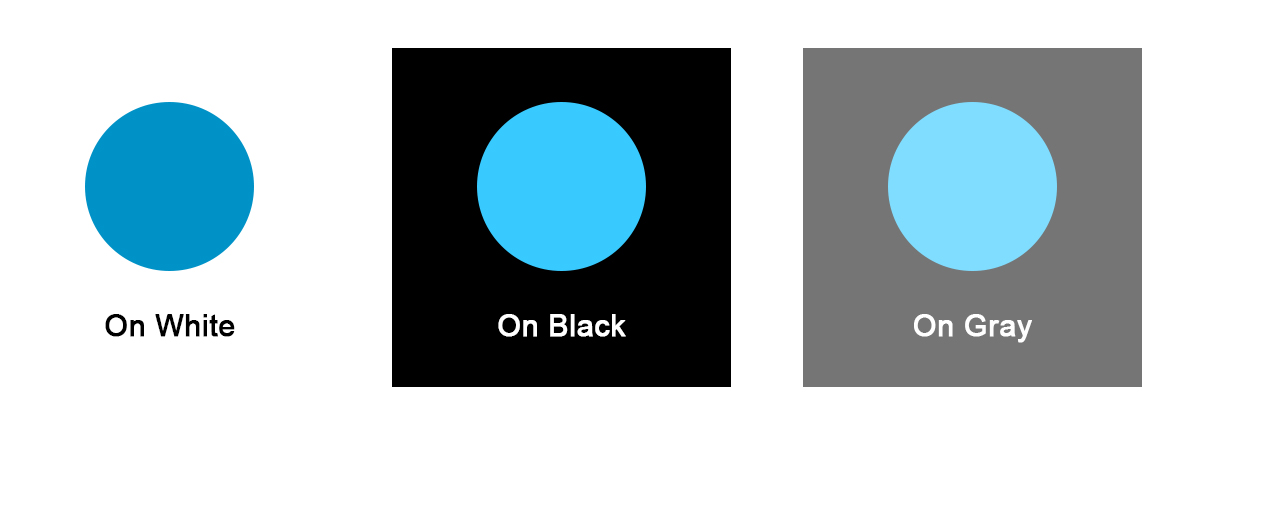
Before proceeding with the website redesign, it was necessary for Swann to update their branding. Upon reviewing the ADA compliance report, I identified contrast errors with Swann's iconic cyan blue, which meant that it could not be used throughout the website. In a discovery workshop with the client, I presented several variations of cyan that would pass the contrast test, but these options were deemed dull and uninspiring. After further discussion, we decided to maintain the iconic cyan blue by creating three different shades that met the ADA color contrast standards.
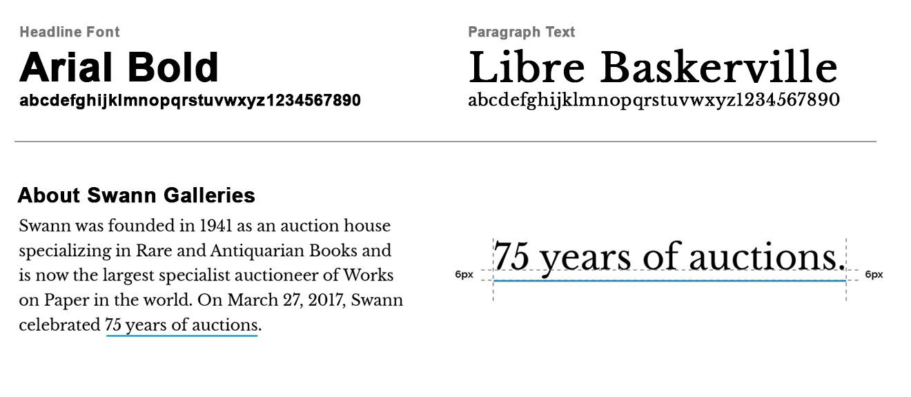
In addition to exploring color options, Swann sought to modernize and editorialize their brand. To achieve this, I introduced a serif font and changed the link styling to a sleek underline. These changes helped to refresh the Swann brand and align it with their desired aesthetic, while still maintaining continuity with their previous branding.
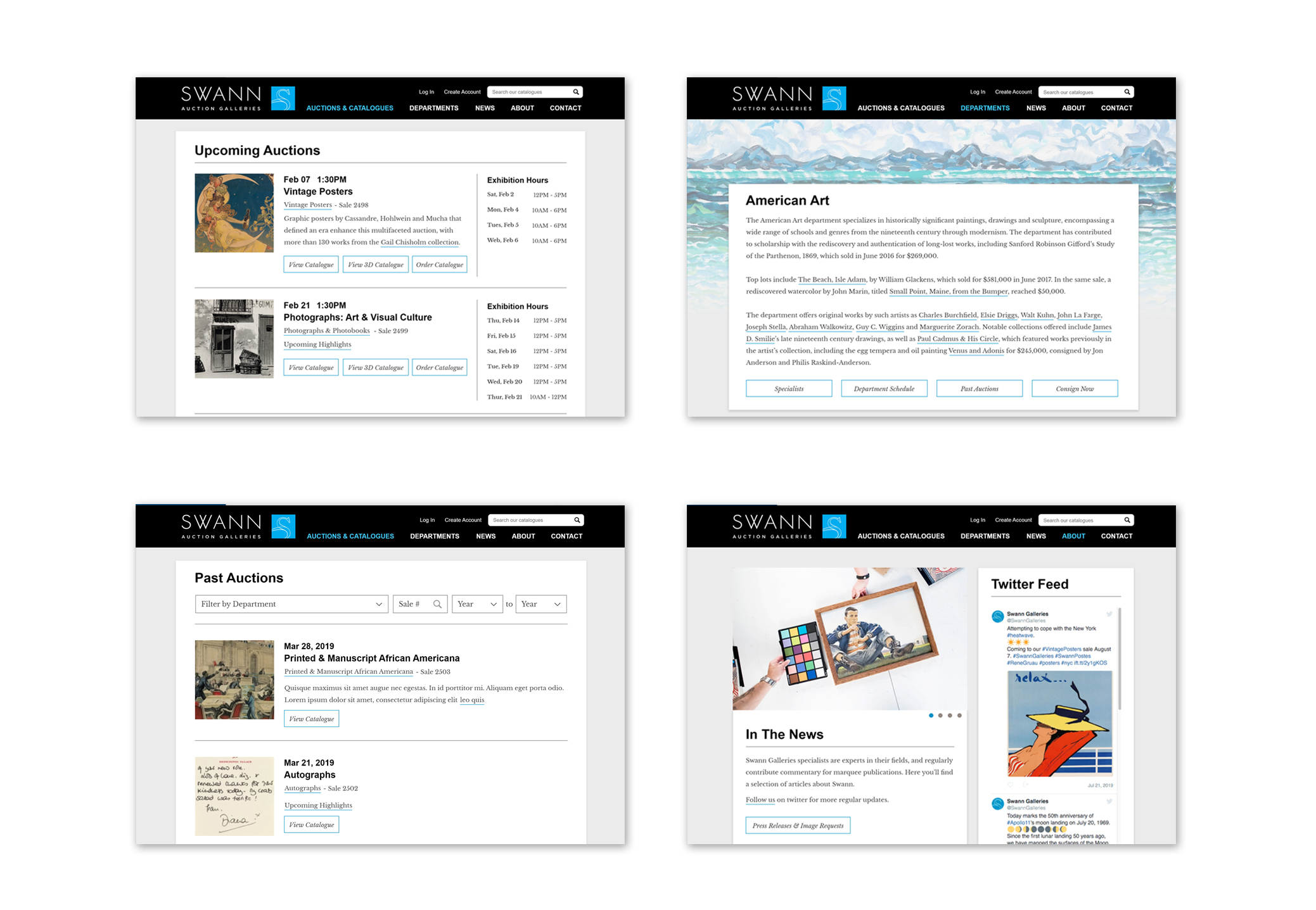
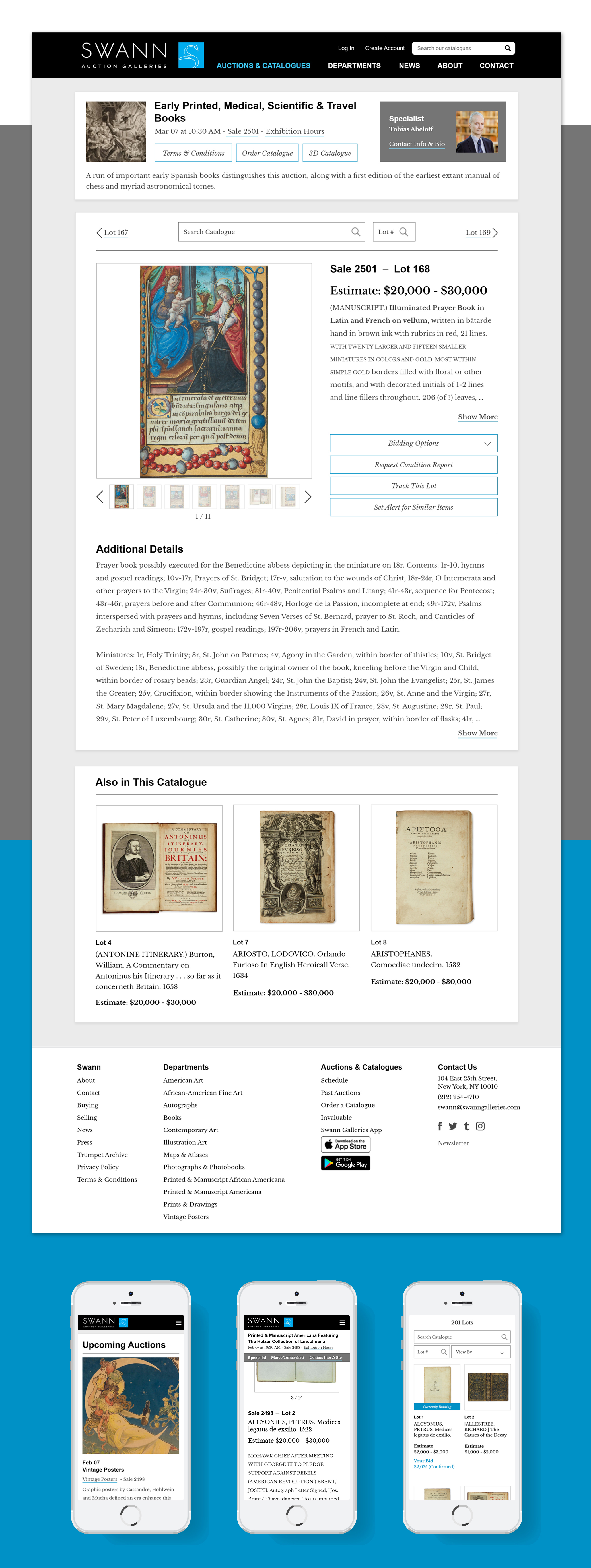
Designing An Integrated Experience
The Swann website is comprised of multiple systems that reside on separate servers, including the CMS, catalogue, and news sections. To ensure a seamless experience for users as they navigate between these systems, it was important that the design and functionality remained consistent. This required collaboration with Swann's third-party cataloguing vendor and a WordPress programmer to integrate the various systems.
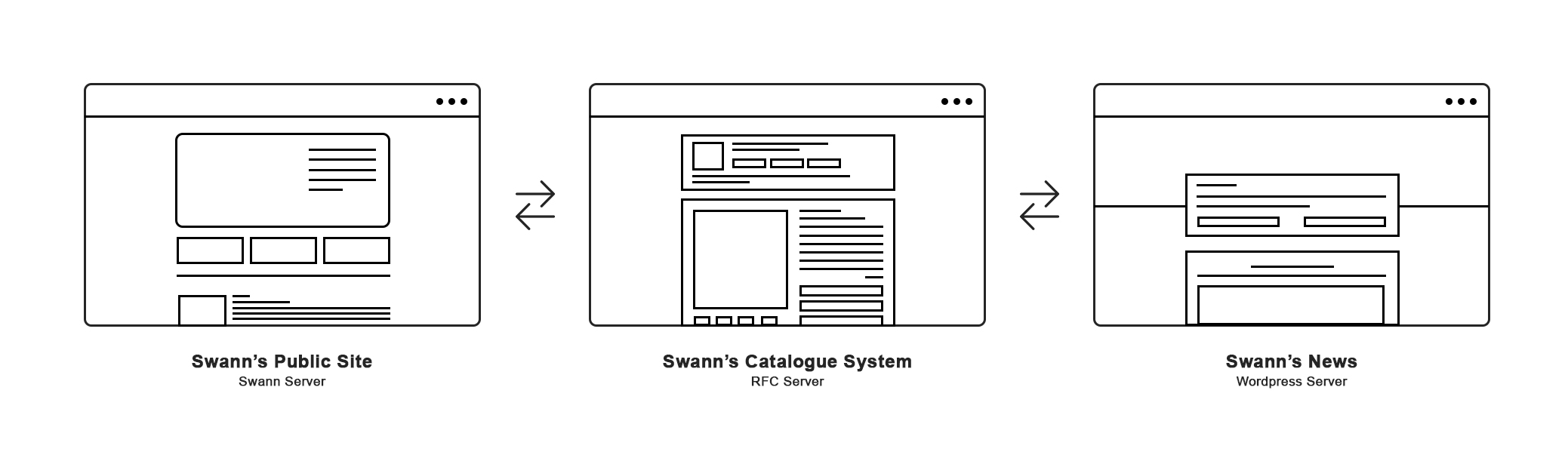
To facilitate this process, I organized a series of workshops to present prototypes to all parties involved and ensure that they understood the design and functionality of the new website. In addition, frequent communication and bi-weekly status meetings allowed us to address any coding challenges that arose while adhering to ADA guidelines. By coordinating closely with all stakeholders, we were able to deliver a cohesive and accessible website.