NewYork-Presbyterian
NewYork-Presbyterian is one of the nation’s most comprehensive, integrated academic health care delivery systems, dedicated to providing the highest quality, most compassionate care and service to patients in the New York metropolitan area, nationally, and throughout the globe. They have an extremely established and strong brand but lacked a central hub for their employees to find and create their branding marketing materials.
My Role
Designer
The Goal
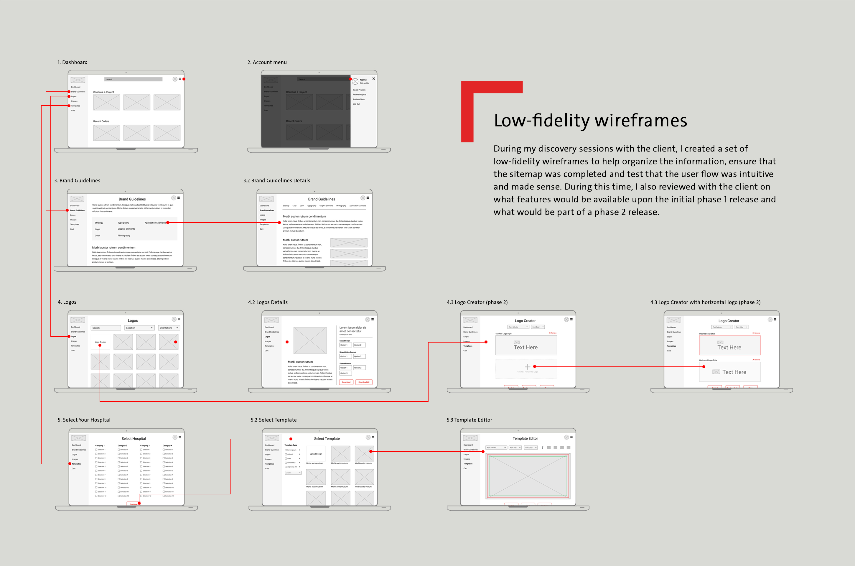
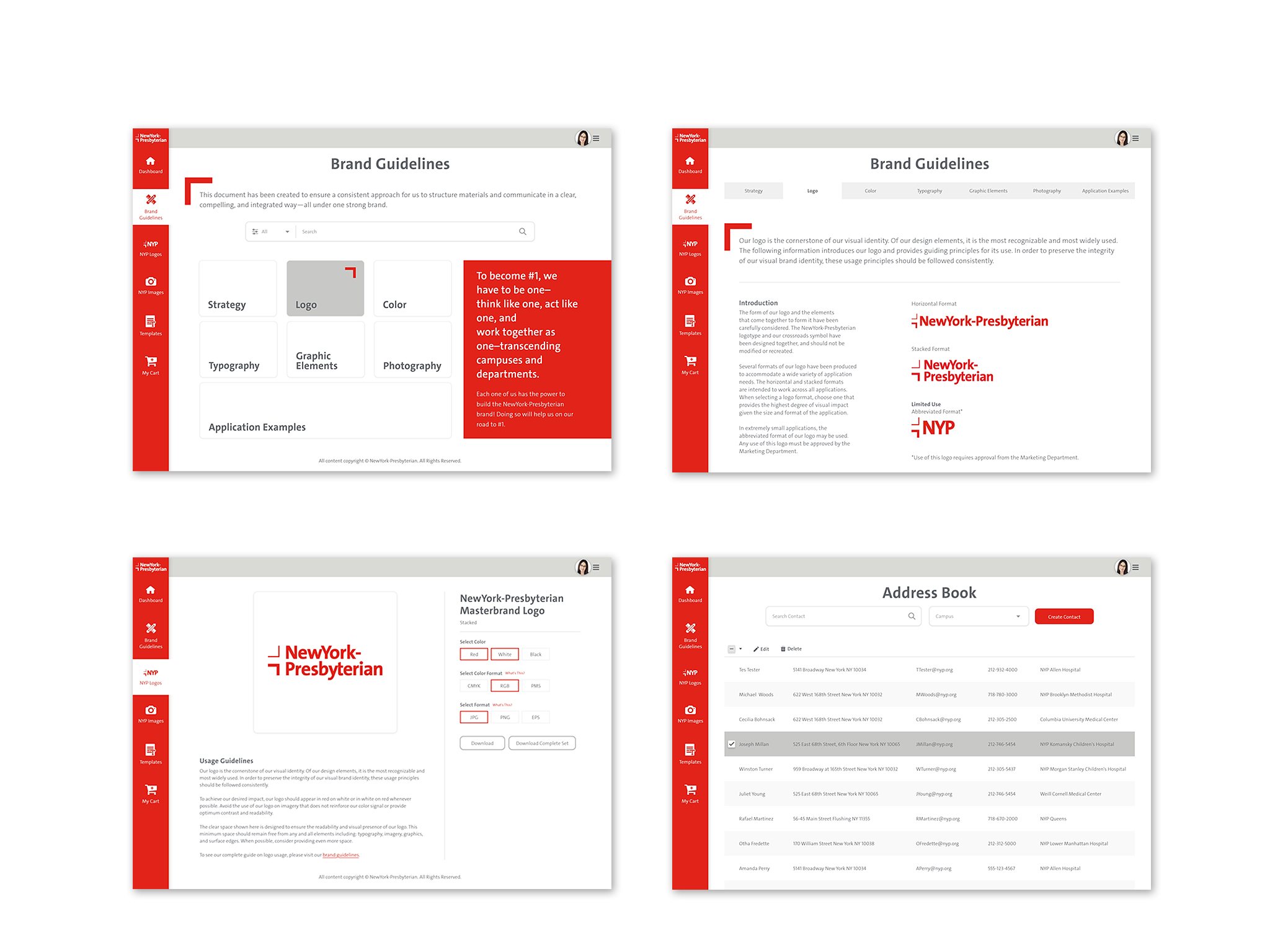
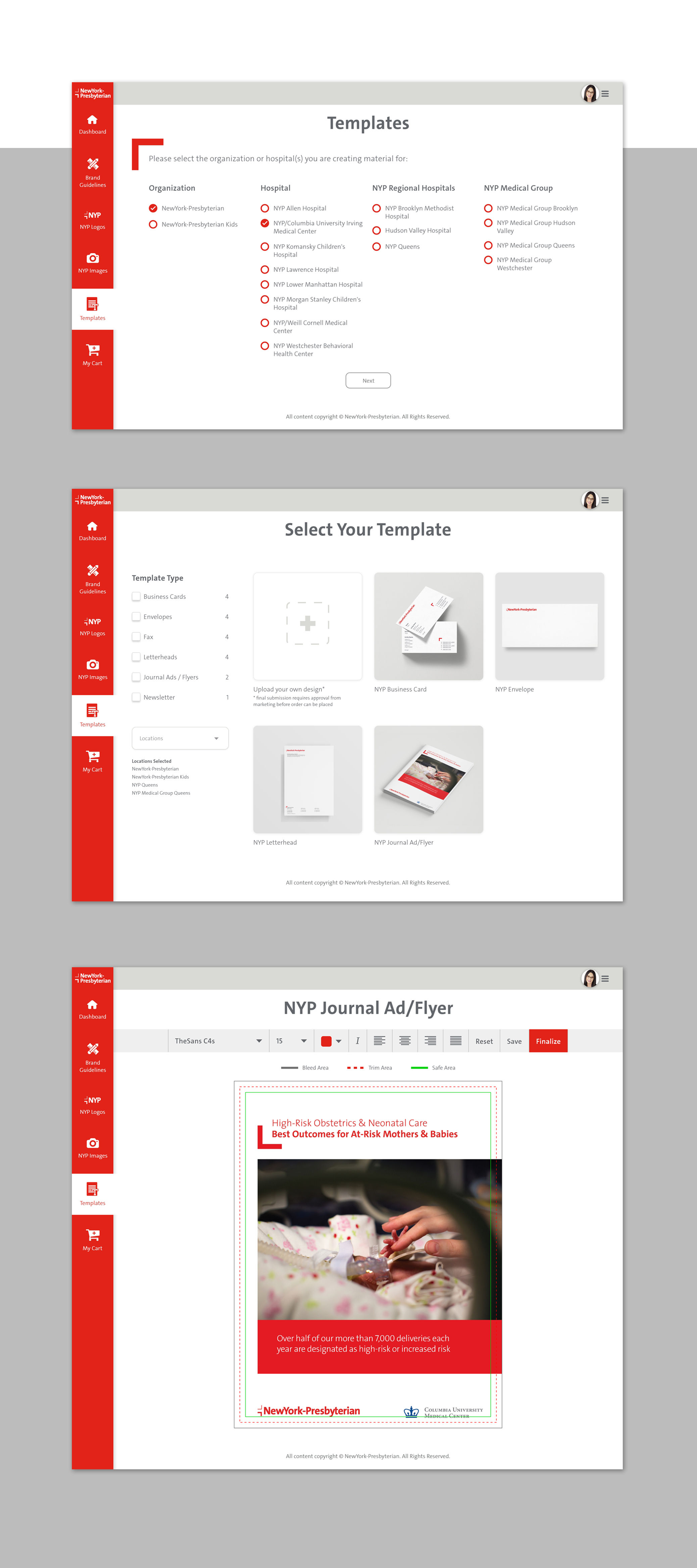
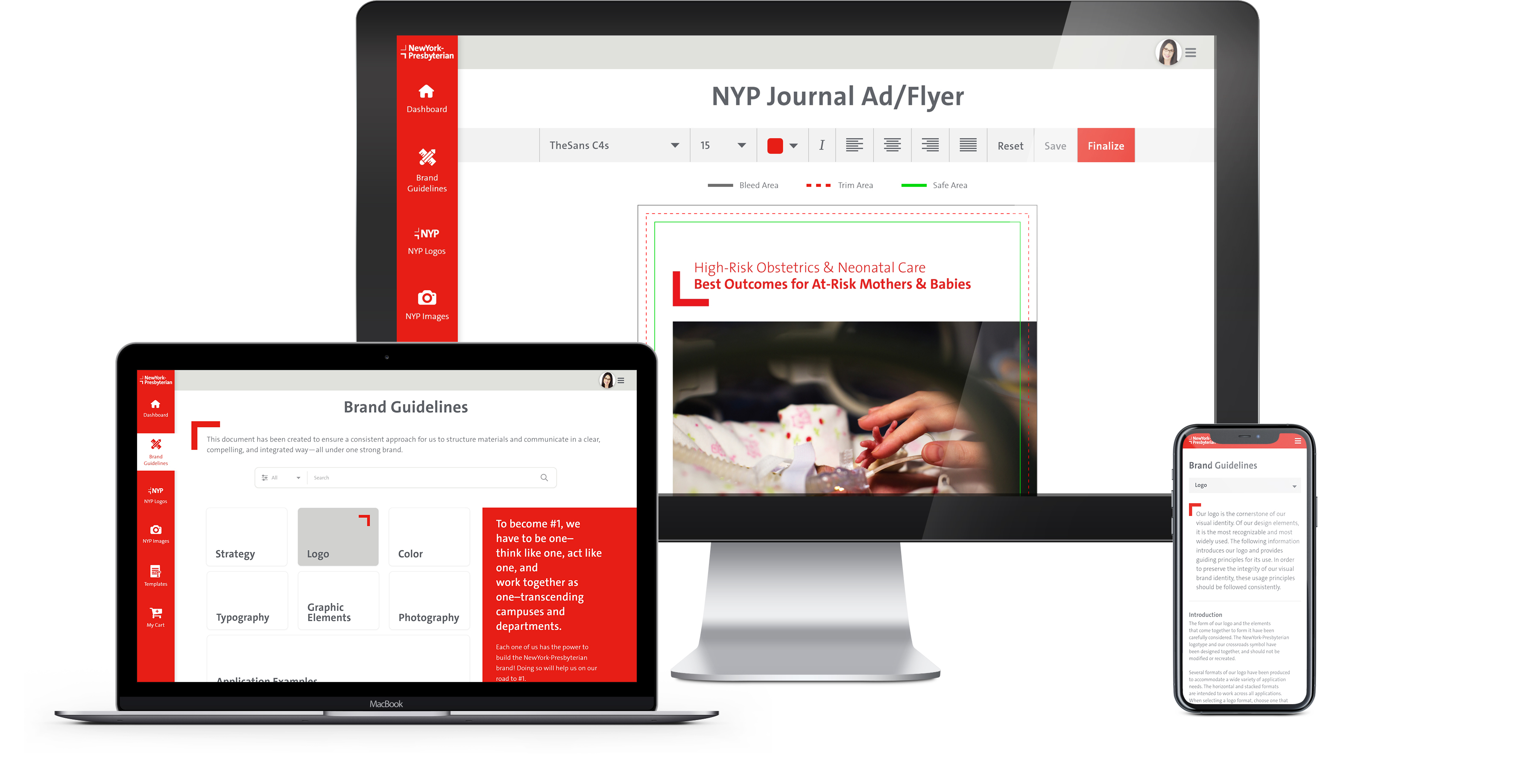
Create and design an all-in-one digital brand portal for employees to easily log in to create and order their NYP branded marketing materials such as: business cards, flyers and journal ads, and have access to their brand logos and other brand assets.
The NYP Brand
NewYork-Presbyterian is known for their NYP red. While they had several other accent colors that were not red, they are often used sparringly, if ever. They wanted their brand portal to follow the NYP branding and red as the primary interface color.
Color Palette

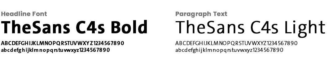
Typography
The Point of Intersection
The pointer is a red graphic element inspired by
the NYP logo, may be used in a variety of ways. One of the most functional uses of this graphic is to stage information. To maintain the sense of an intersection, the optimum distance of the pointer graphic to an adjoining element (color field, image, etc.) is between 1/3 and 2/3 of the height of the pointer graphic. When using the pointer to stage text content, the optimum placement of typography away from the inside edge of the graphic is equal to 1/3 of its height.