
Cushman & Wakefield
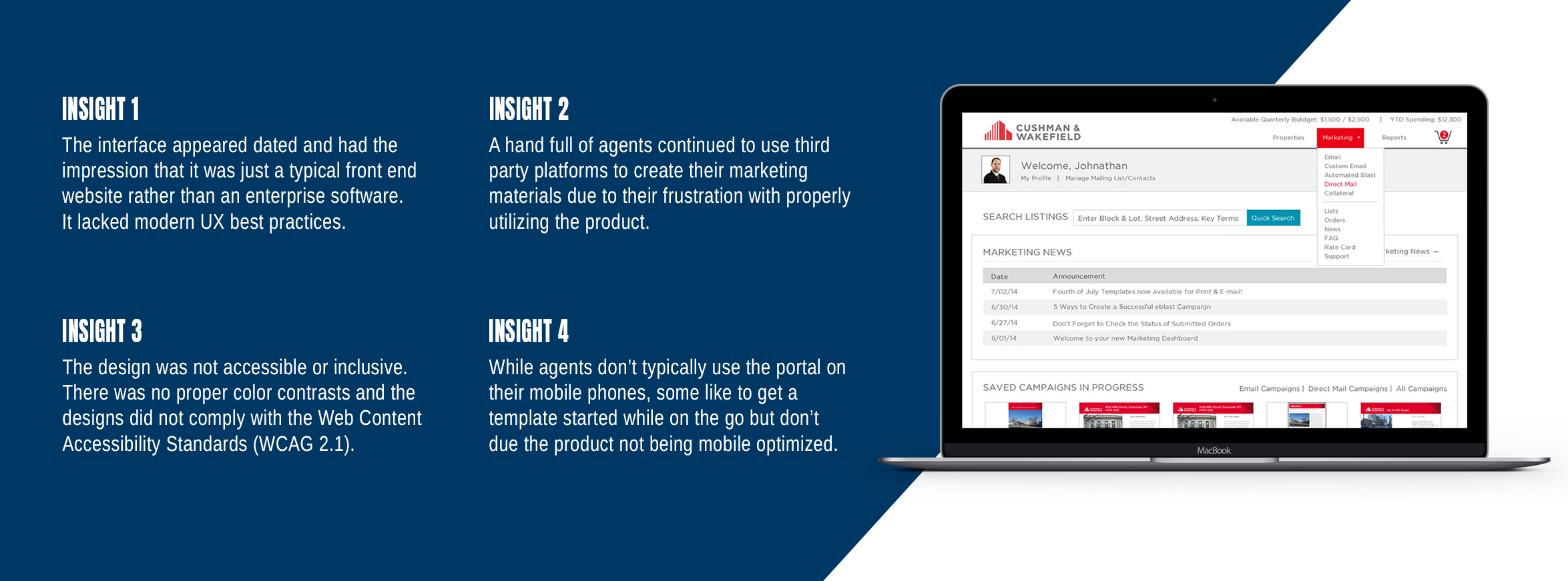
Since its launch in 2014, Cushman & Wakefield's marketing portal has been widely adopted by thousands of their real estate brokers to manage all their marketing needs, including the creation of marketing materials, mailing list management, and reporting analysis. After 5 years of successful use, the underlying technology had evolved and the interface design had become outdated and lacking in modern UX interactions.
The Goal
Enhance the user experience by identifying the most important features through research and improve the visual designs to be more user-friendly, incorporating modern UX interactions. Prioritize usability and a simple clean design to improve the efficiency and clarity for users.
Project Type
Product Design
Role
Product Designer
Tools
Adobe XD
Timeframe
2 Years
Product Audit & Insights
In 2014, Cushman & Wakefield initiated the development of a marketing portal to streamline the creation and production of marketing materials for both their in-house marketing team and external agents. The goal was for both agents and marketing team alike be able to access and design their marketing needs in one central hub to maintain brand consistency across all their designs.
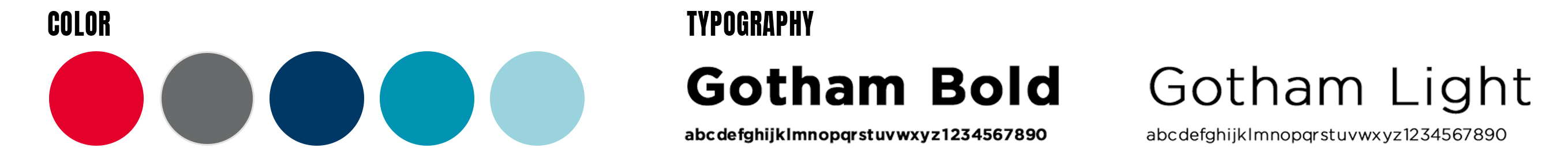
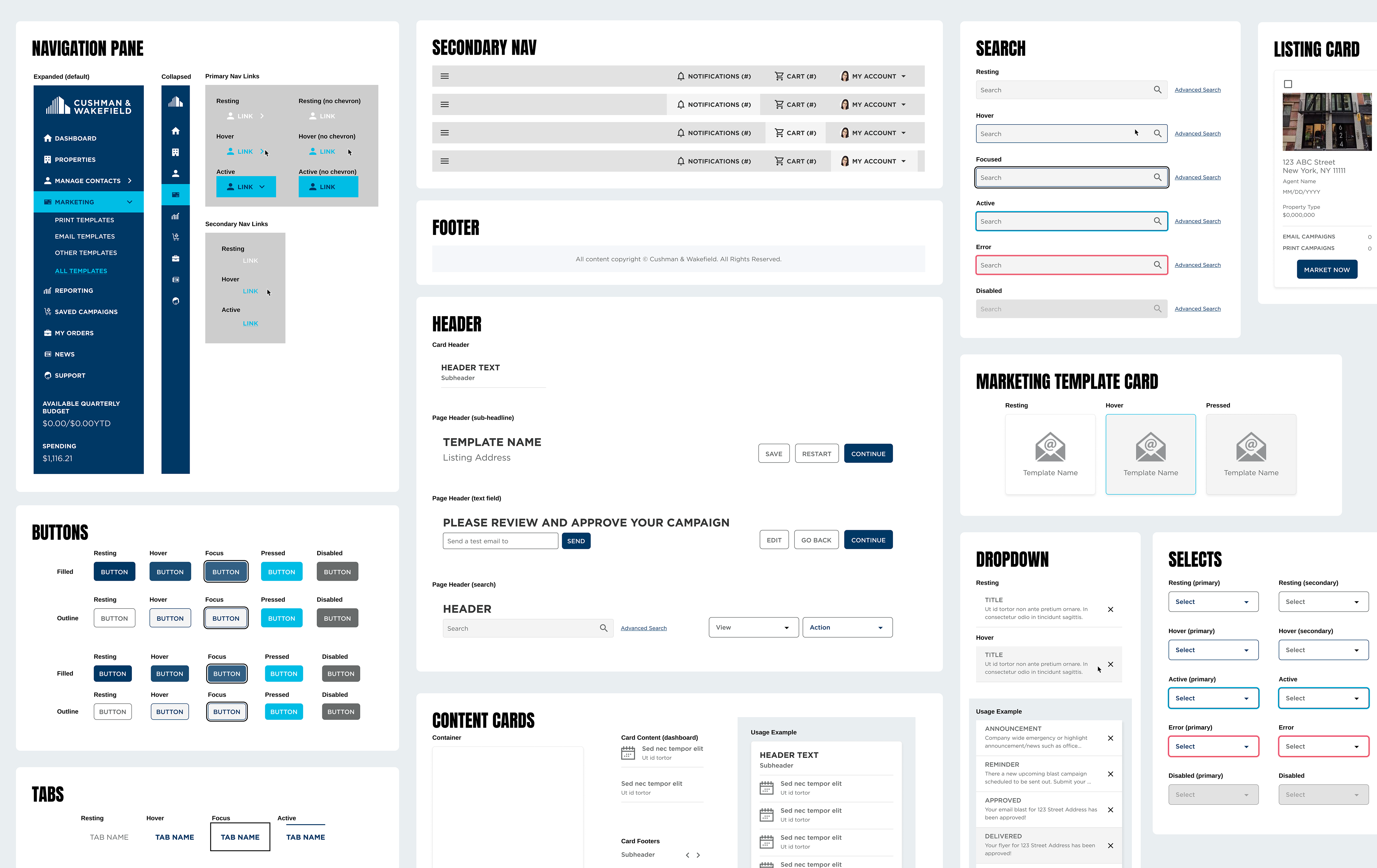
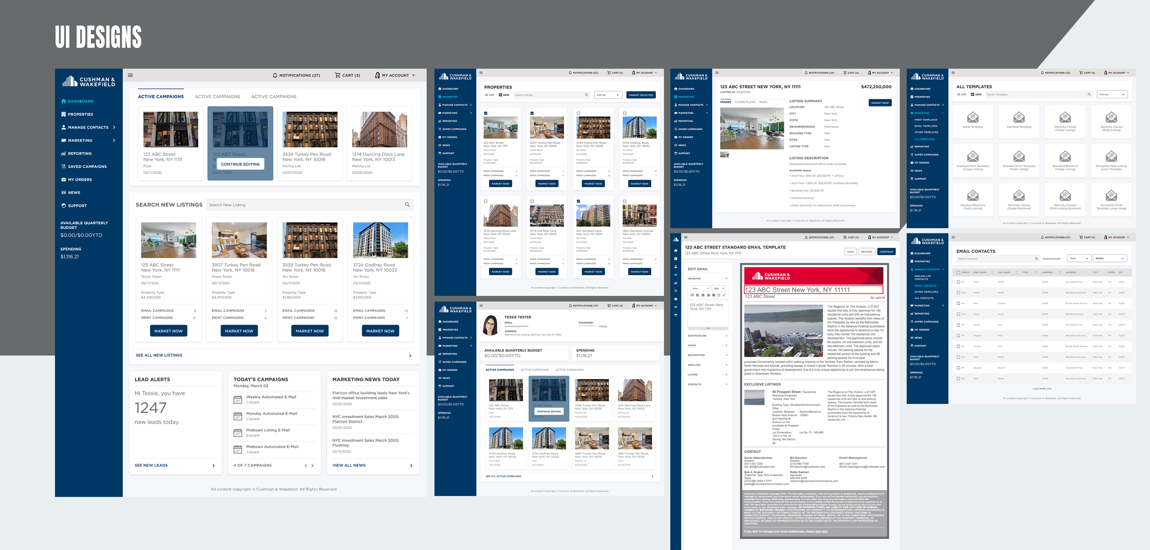
Creating a design system & resuable components
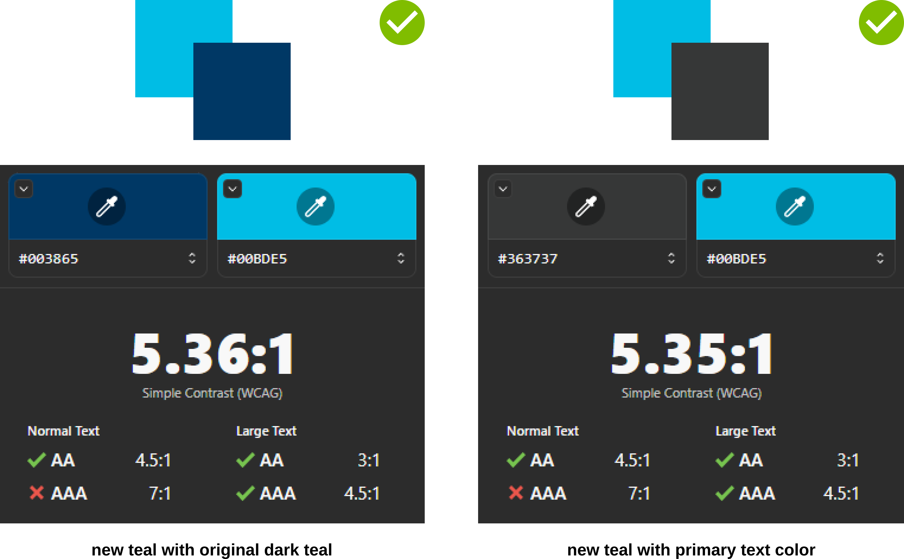
While Cushman & Wakefield is known for their intense red, it felt too straining on the eyes through a screen so I decided to make the teals the primary colors for the UI. With that decision made, I knew I had to make some adjustments to the brand colors. Based on the audit, the teals did not comply with the WCAG 2.1 contrast ratio against certain colors so in order to make it work, I had assess and adjust them.
Original Teal
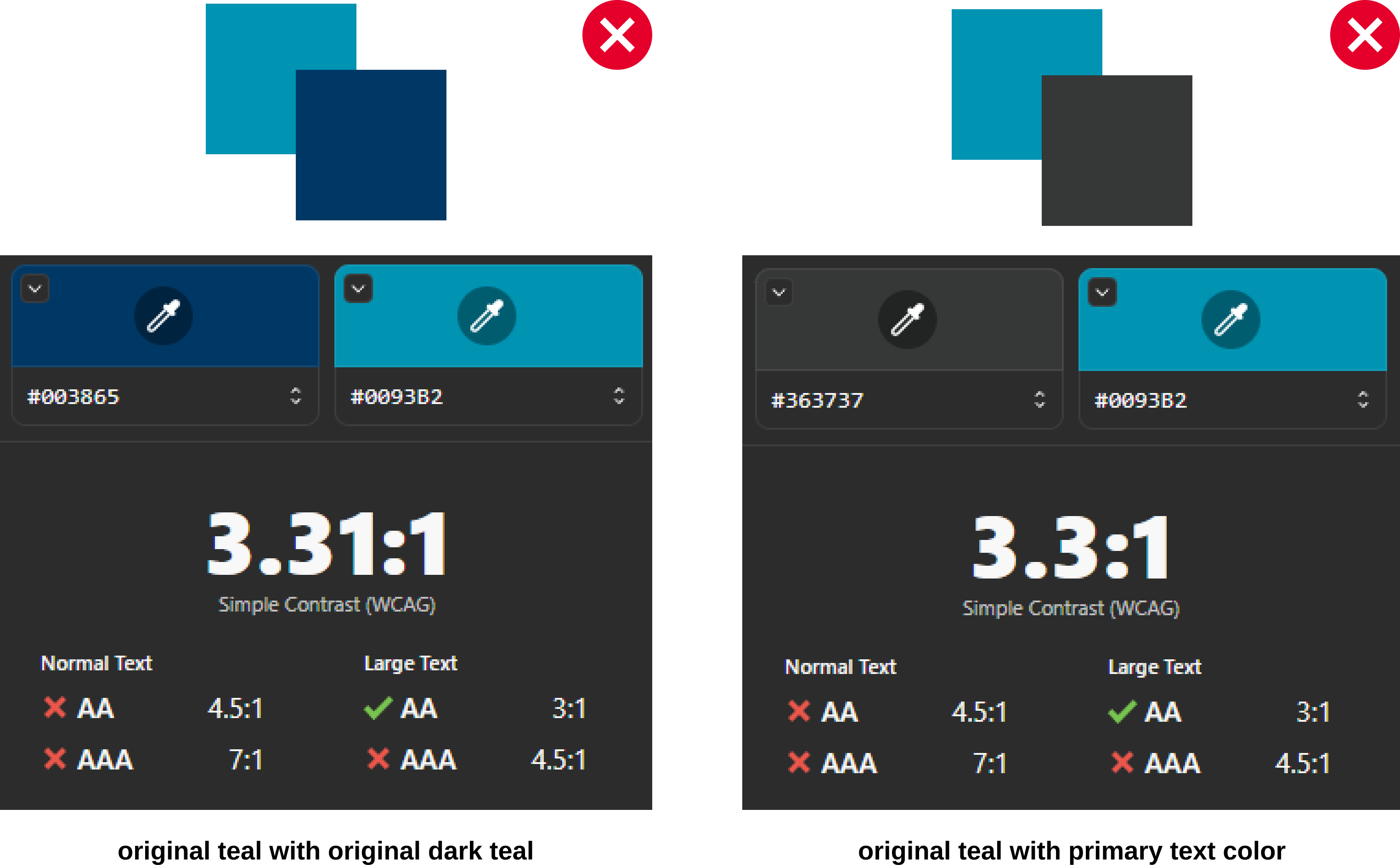
New Teal

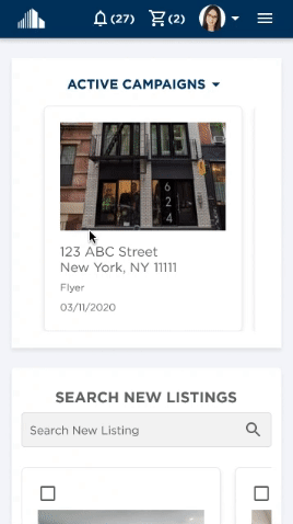
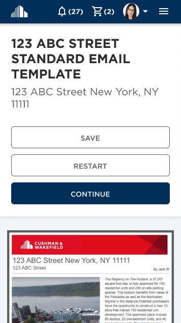
Mobile Designs
My typical design strategy is to design for mobile first and then expand for desktop. However, I realized the client had some difficulty translating mobile design concepts to desktop. After much deliberation, I decided it was best to do the reverse and design for desktop first but keeping heavily in mind the mobile experience. To made the transition from desktop to mobile as effortless as possible, I made use to use make my components scalable so that when it shrinks, the component remains the same as how it looks on desktop.
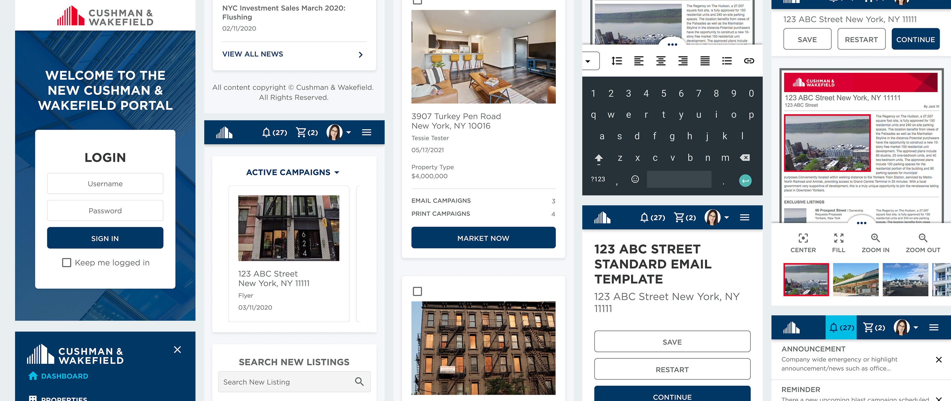
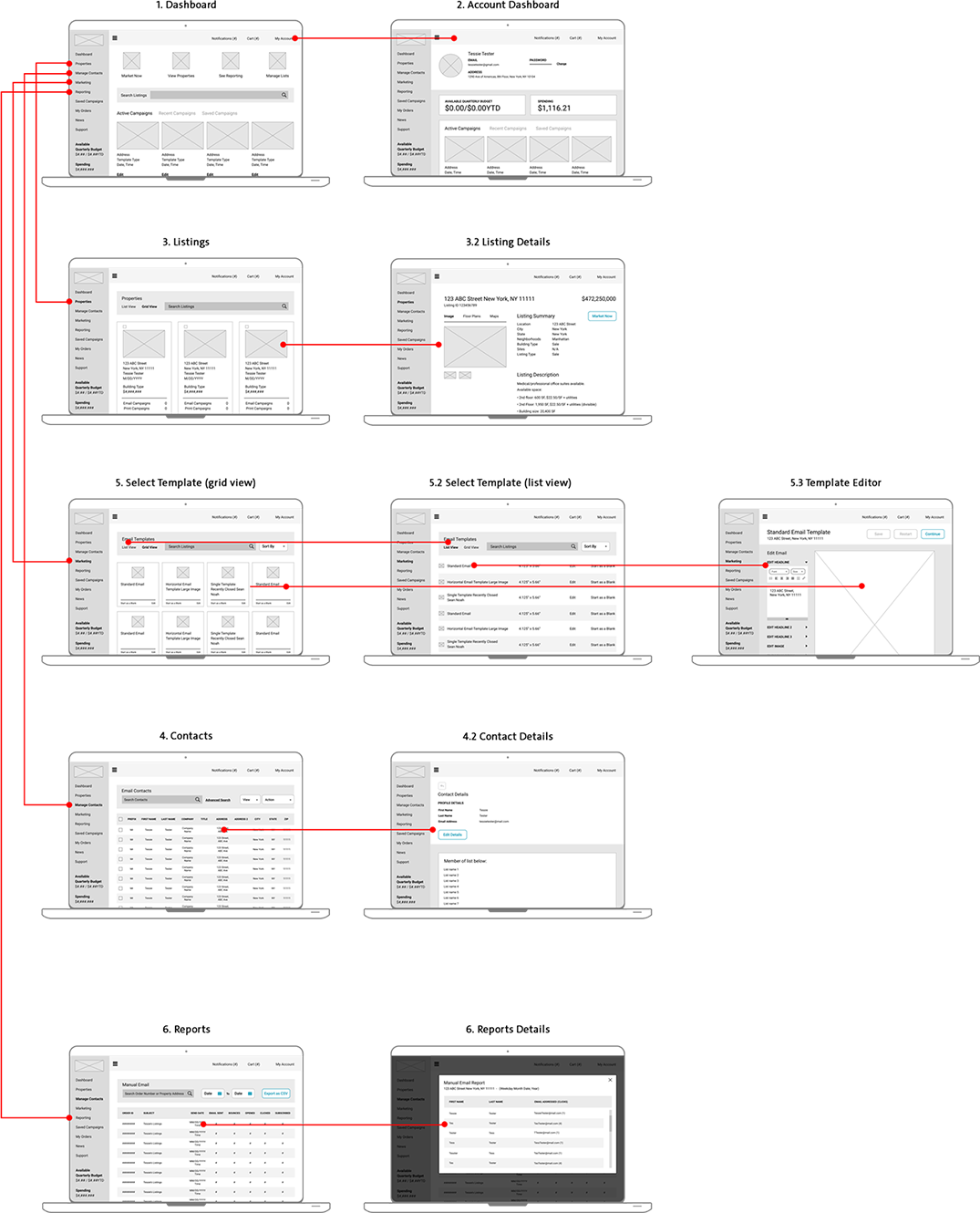
Clickable Prototypes
The biggest challenge when it came to designing the mobile UI is the template editing. When creating and/or editing a template, users typically like and need to have as much screen real estate as possible depending on the template they are trying to create. On mobile phones however, there are some restrictions due to screen size.
After going back and forth with several iterations, I decided transforming the editing sidebar to a bottom drawer would be the best option to maximize as much space possible for the template. The bottome drawer would have to remain compact however, as to not take too much vertical space. In order to fit all the editing features, I decided to make the content in the draw swipeable from left to right..